Creating a Donut Chart in Tableau
What is Donut Chart?
We all may have heard about pie chart in various statistical reports and analysis. In that same vein, donut chart is a pie chart that is hollow at the centre. And in that space, we can insert even more visual data representations that further includes more statistical data. The donut chart is simply the evolved version of the pie chart, which is traditionally used to represent data in the form of percentages of the total of something and this pie chart have been very useful for visualising statistics.
Skills like this are so important that our Hope Tutors provides best Tableau training in Chennai. Our Tableau certification is regarded as a benchmark and will certainly place you on top of every job opportunities and career paths.
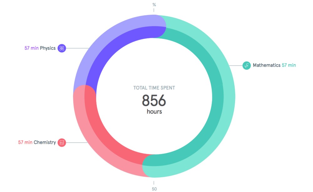
The example of a donut Chart:
There is a notable option called dual axis option in Tableau. With this feature, we can generate a donut chart. And this characteristic opens up multiple combinations of different chart prototypes. Building a donut chart chiefly constitutes in placing a circle in a pie chart. The major advantage of this type of graph is its efficient capability to include additional information about the given data.
Creating a Donut Chart:
There are principally three basic steps to create a donut chart:
- Create a usual pie chart
- Layer a blank hole in the middle and create the inner chart.
- Add a label on the inner blank space.
Step 1: Creating a pie chart
As the emergence of donut chart can be traced back to the pie chart, creating a pie chart is the first step to create an evolved version called Donut Chart. So the stages to generate a pie chart are follows.
-
If we want to depict certain numbers and its average representations, take the given number and drag it into the Rows segment of the worksheet and edit the Average. Redo this step over again so that we can have two green marks in the Rows section.
-
Right-clicking on the right-hand green mark will lead us to pick Dual Axis.
- Pick the first pie chart segment in the area and drag the substantial category and place it on the coloured section.
-
The measure can be stated at this stage and placed in the angle.
Step 2: Creating the Inner Chart
Now after creating successfully a pie chart, the sub-divisions has to be defined at this stage. So we are going to see how the second pie chart is produced.
-
Choose the second pie chart drawer in the preferred section and drag the largest category we need to include in the chart and put it on the colours segment.
-
Then pick the measure, quantity, or any attribute of that particular material and put it in the angle.
-
And then with the support of size, we can adjust the visibility of the final version.
-
Some changes in the formatting and sifting can be a bit tricky. We just need to be careful while we decrease the size of the second circle.
Step 3: Fill up the inner space with details.
-
At this phase, we need to add a table to the calculation and the measurement of the variable we may provide and make a label.
-
And for the inner chart of sub-category details, we need to show the breakdown of each category, and this is done by creating a Total Table Calculation.
-
And for the most accurate depiction, we also should change the axis endpoint to the preferred result, thus further adjusting the charts to the middle and we bring them into dashboard settings.
The role of Hope Tutors in training you with Tableau and its inner workings is top-notch and help you understand the entire concepts in the light of thoroughly designed Tableau certification course.
Do you want to learn QlikView vs Tableau click here…