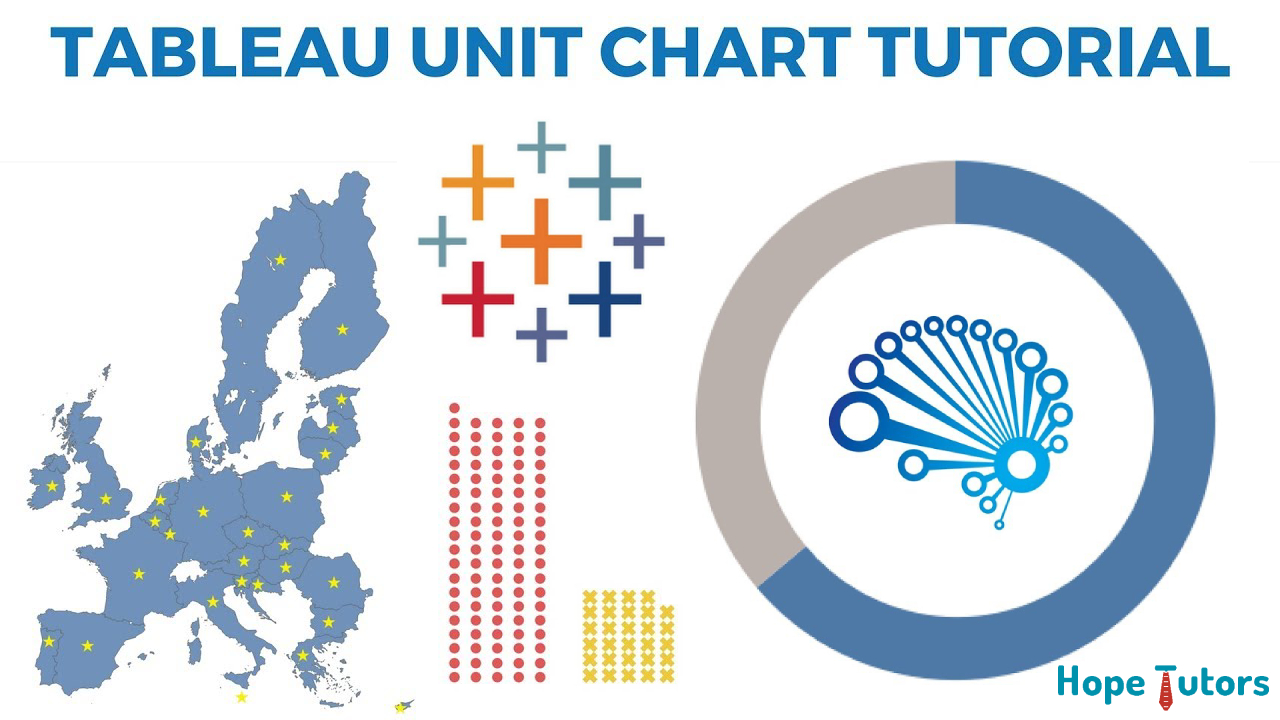
When to use different Tableau Charts
Data Visualization
It is multi-discipline equivalent to visual communication. The data visualization involves in the creation of the data. It involves in the study of the visual presentation of the data. In simple terms it is the understanding of the data. This is possible by placing it in the visual context. It is said to be both an art and the science.
It will communicate the information clear as well as most effective. This is possible using the statistical graphics as well as the plots. It will also use the information graphs as well as the other tools.
The numerical data may represent using the dots. It will represent as the lines or by using the bars. This helps in communicate the data as a quantitative message. The effective reports help us to analyze the data. It makes the complex data to understand simpler as well as usable.
Tableau
Tableau is one of the best data visualization tools. Tableau software developed this tool. It is the most trending as well as the most popular tool. Tableau is a business intelligence tool. It is used to visualize the data. It is also used to analyze the data fast as well as easy.
The one of the best features of Tableau is Hybrid connectivity of Cloud. It is the tool used for the data analyst. The Python as well as the R scripting will support the Tableau.
Tableau is easy to connect with the different data resources. The different data resources include Excel as well as CSV. Tera Data and the Google Analytics are also included in this.
Tableau provides the tableau desktop as well as the tableau server. Single users as well as enterprises uses this.
The Tableau desktop is one of the best tools for the single users. To Create the data visualization, we use the Tableau desktop. For publishing the data sources, we use the Tableau desktop.
The Tableau server is one of the best tools for the enterprises. It aims at combination & security of data visualization. To Share the data within the industries we use the Tableau Server.
Tableau Chart:
All the changes with the data can represent as picture. In simple, we can represent as charts. We can see the chart selection in the see me menu. There are 21 different type of chart. They are as follows,
- Text Table
- Heat Map
- Highlight Table
- Symbol Map
- Filled Map
- Pie Map
- Horizontal Bar Chart
- Stacked Bar Chart
- Side-by-Side Bar Chart
- TreeMap
- Circle View
- Side-by-Side Circle view
- Line Chart
- Dual-Line chart
- Area Chart
- Scatter Plot
- Histogram
- Box-and- Whisker Plot
- Gantt Chart
- Bullet Graph
- Packed Bubbles
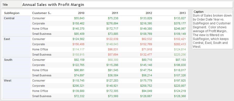
Text Tables:
Text Table gives same view as the Excel sheet. It will Split the data into rows and columns. This text table is used to give the simple visualization of data. The mark type of Text Table is Text.
When to use? Simple data display uses Text Table. Appendix inclusion would be nice using text table. When user wants traditional visual, Text Table is useful.
Heat Maps:
Heat Map is the way of visualizing the data in cross-tab. Heat map divides the data into different categories.
When to use? Heat Map can be used to compare the two different measures. We can view the categories of data with different colors and sizes. Example: To categorize performance of company in different years. We can highlight the performance with the different colors.
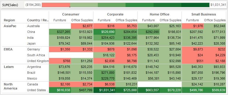
Highlight Tables:
The conditional formatting of the data uses the Highlight Table. Tableau will automatically apply the color schemes. The color Schemes may step or continuous.
When to use? When we compare the field’s value with row or column, we use Highlight Table. Transition from the traditional cross-tab to abstract heap map uses this. Example: Visualize the sales data for different countries for segments. The color patterns can used to highlight the best performer to poor performer. This is possible in abstract way.
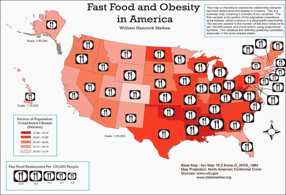
Symbol Maps:
Tableau is useful in utilizing maps for visualization. There are two categories of Maps. They are Symbol Maps and filled Maps. Symbol Map is a type of mark to represent the data point. Tableau provides zoom in and zoom out facility. Filled circle is one of the best examples of mark.
When to use? Symbol Map is used to represent statistical data as data points. Example of Symbol Map: Fast Food and Obesity in America.
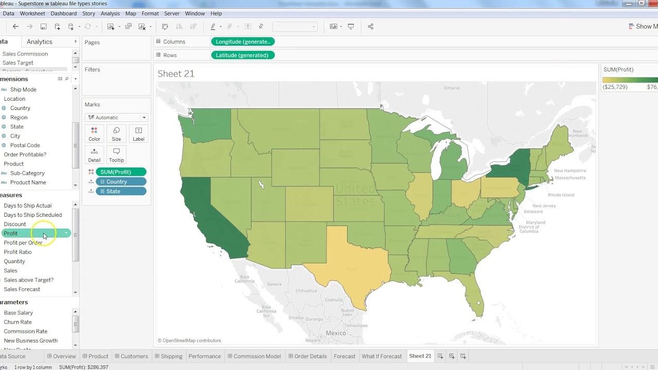
Filled Maps:
Filled Map is another type of Map for visualization. Filled Map uses shading of geographical regions. Tableau software provides facility to list all states in a country.
When to use? If user wants to see all branches in a country. The states in that country can filled with a color to mark data. Same way the countries can marked in a map to see the branches.
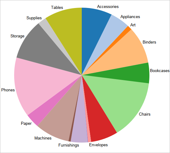
Pie Charts:
Pie Chart is used to show the proportional and percentage relationship. It is an easy way of visualizing the relative value. Pie Chart is the most meaningful in the data visualization. Horizontal bar charts can replace with Pie charts.
When to use? When there are multiple categories of data, we can use Pie Chart. Example: To visualize the sales percentage of each state. The Pie charts are useful to create a story for the data.
Horizontal Bar Charts:
Horizontal Bar Chart are used to represent the data in bar lines. Bar lines can be of two types. They are horizontal and vertical. It is a simple and effective way of visualizing the data.
When to use? We use Horizontal Bar Chart when there is requirement of sorting of data. Example: To visualize the sorted order of the company’s profit.
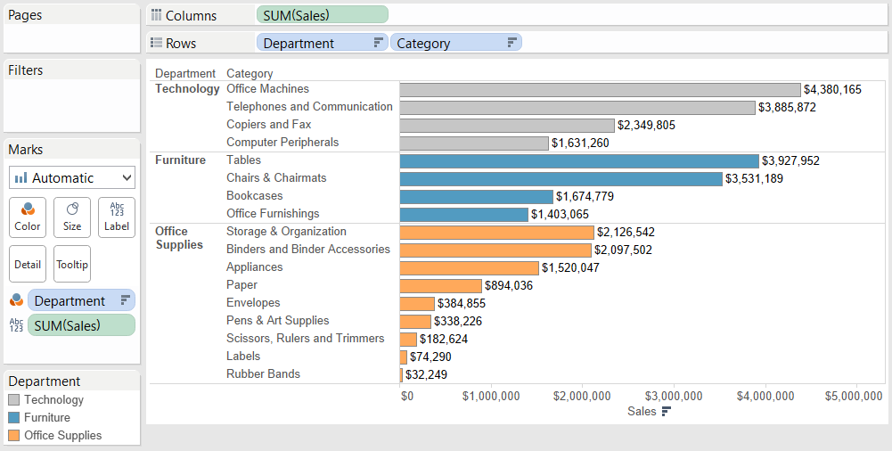
Stacked Bar Charts:
It is the way of having additional data in Horizontal Bar Chart. It adds another dimension to the Horizontal Bar Chart.
When to use? Stacked Bar Chart can use when the data has several subgroups. The groups can consider as the different dimensions. Example: Visualize the sorted order profit margin of company. Each bar has a subgroup such as sales as well as the marketing. The different colors can be used to represent the different subgroups.
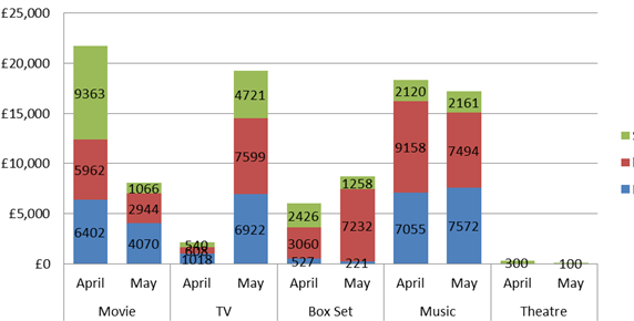
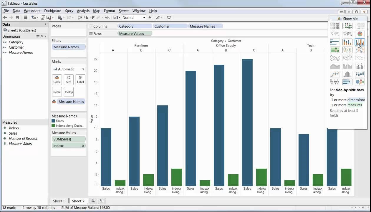
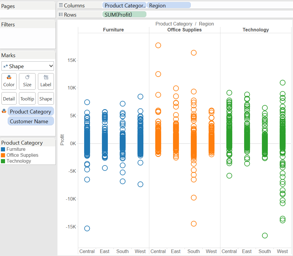
Side by Side Charts:
It is used to compare & visualize data with different comparisons. This is used to visualize different segment of info at single place.
When to use? Comparing the different category of data uses Side by Side Chart. Example: Using this we can Visualize the Comparison of sales. Sales of Smart Watches, Video Cameras of company etc., uses this Side by Side Chart.
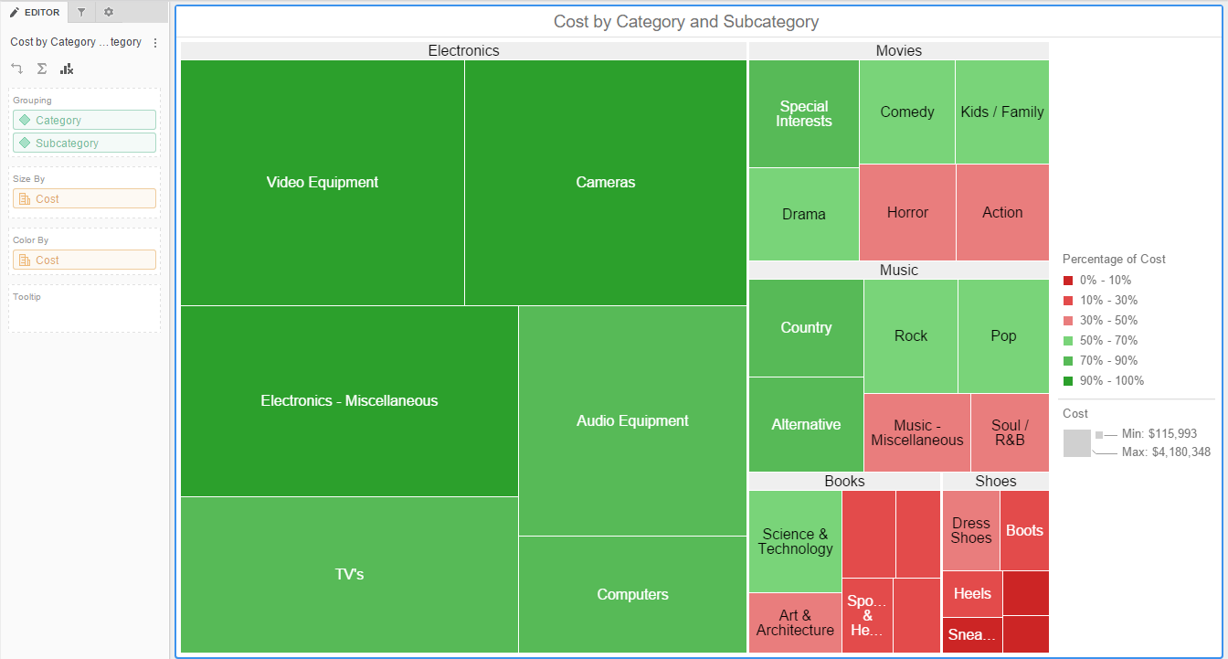
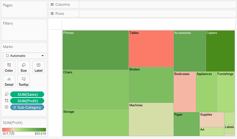
Tree Maps:
It is one of the one of the most powerful visualizations. It is used to illustrate part-to-whole relationship & hierarchical data. They are useful in visualizing thousands of data in a single view.
When to use? Whenever there are huge number of info & relationship, we use this. Example: Comparing the sale data of different states across the countries.
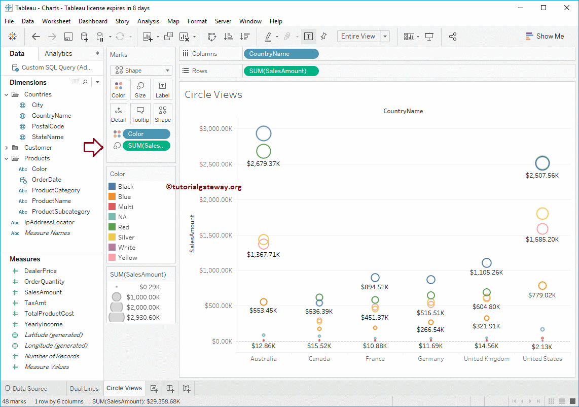
Circle Views:
Circle View is one of the most powerful visualization. It is just used for the comparative analysis. The analysis will represent by using the circles.
When to use? Comparing data with powerful visualization uses Circle View. Example: The marking profit across all the countries. The big circles will represent the most profit. The mall circles will represent the lower profit.
Side by Side Circle Views:
This is variant of the Circle View. It is by adding more circles to visualize more measures.
When to use? It is used to compare different category of data in Circle View. Example: The Circle view shows profit is very low in a region. Side by Side Chart will display all segment used to calculate profit. This will help to identify the weaker area where company needs improvement.
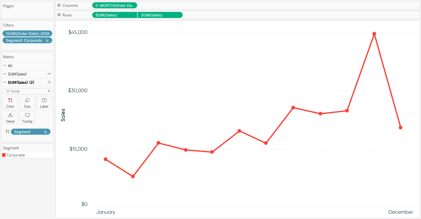
Line Charts:
Line Chart is used to visualize the data in trending manner. Line Chart will show the trend over the period.
When to use? Line Chart is useful to show case the data in different period. Example: Visualize the electrical usage for period of 12 months.
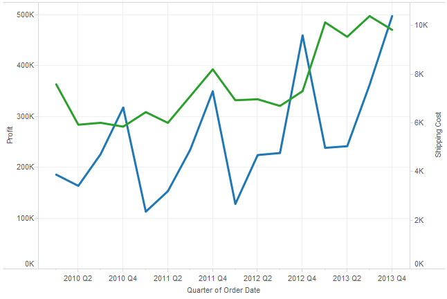
Dual Line Charts:
Dual Line Chart is the extension of the Line chart. In Dual Line Chart, the data will represent in two different angles. Vertical axis is used to represent the different category. There are more vertical axes used.
When to use? It is used to represent the data of different categories. Example: Visualize profit & marketing cost of company in last year.
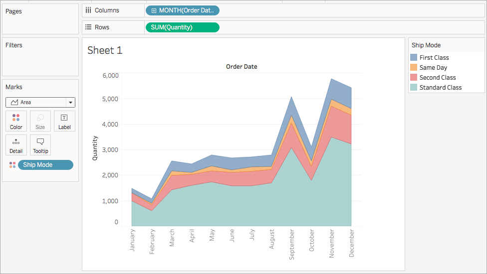
Area Charts:
Area Chart is combination of the line graph as well as stacked bar chart. It is one of the most powerful tools for the relations of percentage.
When to use? It is the powerful to visualize where there are relative proportion. It is useful to visualize the relations of percentage. Example: Comparing the marketing profit of the company’s percentage. It shows the relations between the different categories.
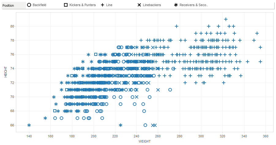
Scatter Plots:
Scatter Plot is to visualize data where there are two different measures. It uses symbols to visualize data. Both axes in Scatter Plot are measures.
When to use? Scatter Plot is useful to compare different measures of patterns. The cluster like patterns identified in Scatter Plot are very useful. Example: Height and Weight of National Football league. Scatter Plot is powerful to see the cluster of data for height & weight data.
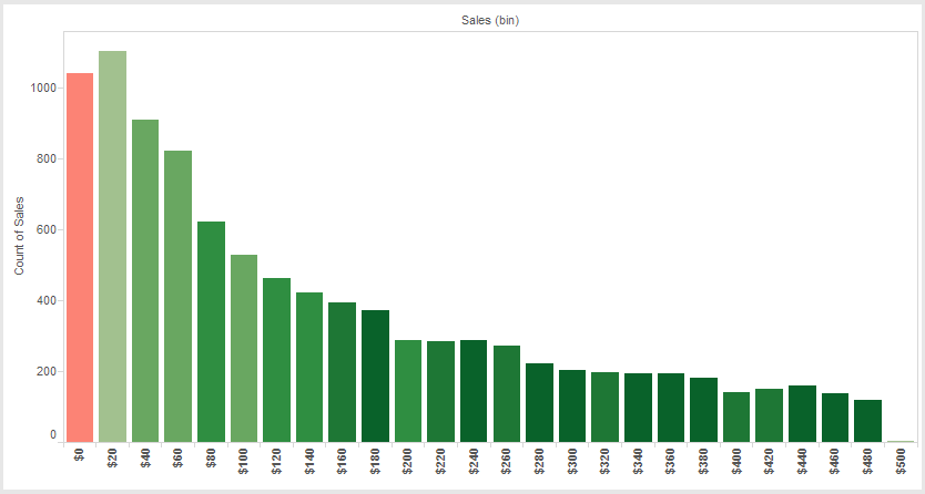
Histograms:
Histogram is visualizing the distribution of the data. The distribution will divide into the bins or the intervals.
When to use? It is used to visualizing data in the different intervals. The further analysis will use the Histogram. Example: Sales data of the company as distribution in $10 interval. The result will give the most useful analysis to improve the performance.
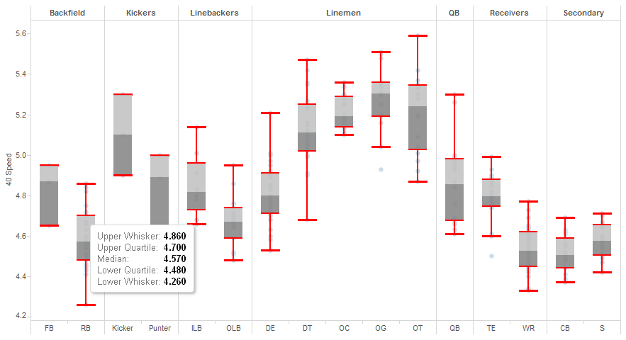
Box and Whisker Plots:
It is used to visualize data in format of box and plot. Box gives values between first and third quartile. Whisker gives distance between the lowest value to first quartile. It gives fourth quartile to the highest value. To plot these values, need to find median of given input.
When to use? Data and Whisker Plot is useful for complex analysis. Example: Representation of 40-yard dash times from 2014 National Football League combining broken out by positioning.
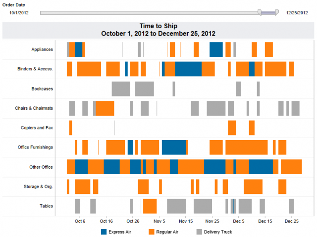
Gantt Charts:
It is way to visualize data in schedule or progression of time. Each task can visualize as separate data point.
When to use? Gantt Chart is used to depict information in relation to time. Example: Time for sending different products to different part of country.
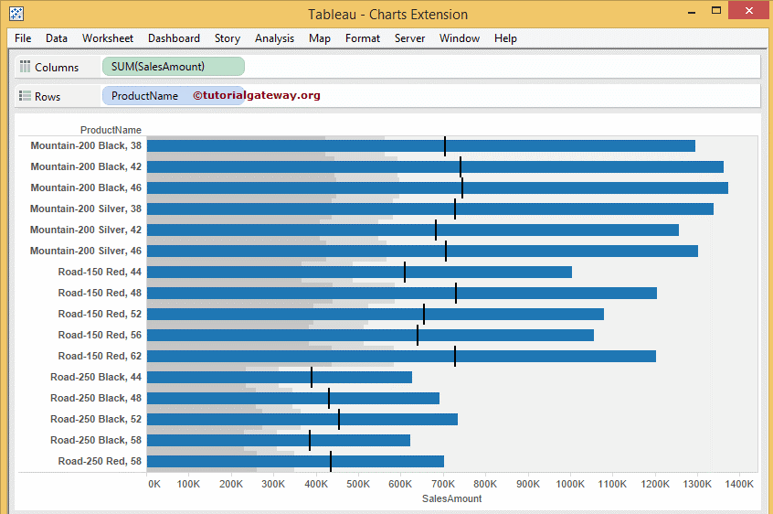
Bullet Graphs:
Bullet Graph is a great way of comparing data with historical data. This Graph is the most useful to represent data in small space. This graph can represent as horizontally or vertically.
When to use? Bullet Graph is used to visualize the progress towards a goal. There is different type of standard bar graph. Example: Visualizing the profit percentage of the company.
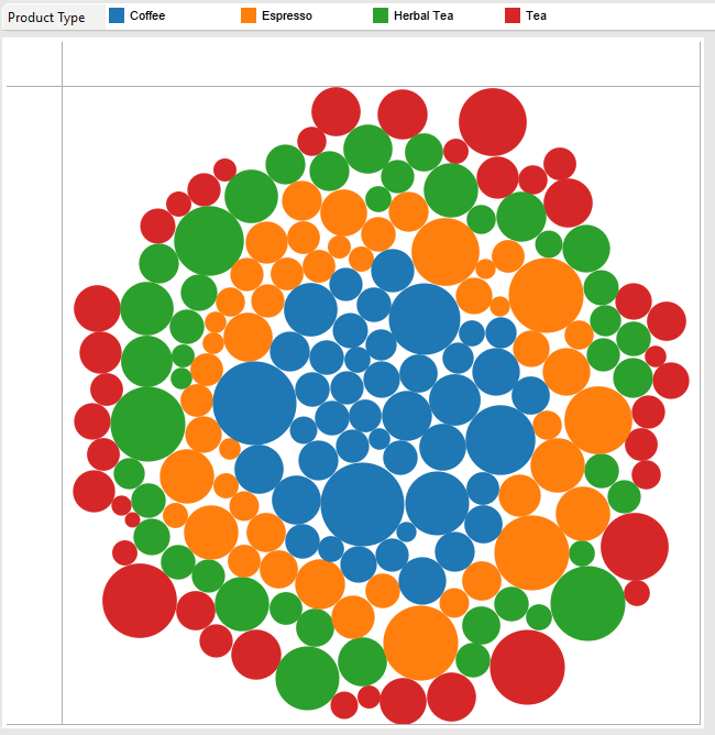
Packet Bubbles:
Packet Bubbles is also known as bubble chart. It will represent the relational values. The bubbles will tightly pack.
When to use? It is used to represent the relational values in different method. It shows data as simply bubbles without axes. Example: Profit earned for different products like coffee, tea of company. This data can represent as bubbles in different colors without axes.
There are lot of training courses for Tableau. In Chennai, Hope Tutors is the best institute. It provides the training for the Tableau. The course covers all these mandatory skills. It covers all the different type of Tableau charts. This will provide you a detail view of when to use different Tableau charts. Field experts are taking these courses. This course will boost the career.